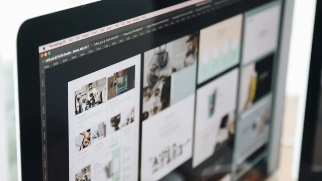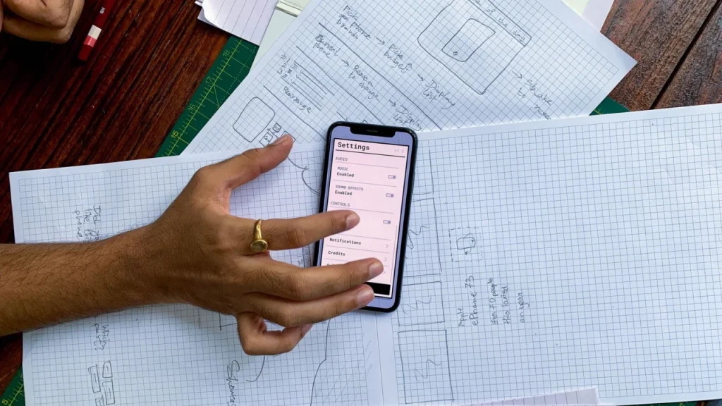
A visitor to your website makes several decisions in the first few seconds: is this a serious business, will I find what I am looking for, and is it worth staying? UX and UI are not a matter of taste but an engineering discipline that steers these decisions in your favor. Below are the principles that really affect how many people stay, how many complete the desired action and how much they trust you.
The difference between UX and UI, and why both matter
UX (user experience) is about how a website works: how easy it is to find information, how many steps it takes to reach a goal and whether there are obstacles on the path to contact or purchase. UI (user interface) is about what you see: typography, colors, spacing, buttons and visual hierarchy.
The mistake we see most often is investing only in UI. The website looks modern, but visitors get lost, do not know where to click or give up on the form. Beautiful design without a well-thought-out flow is like a neat shop window behind a locked door. Both layers have to work together.
Visual hierarchy: guide the eye, do not let it wander
People do not read websites word by word. They scan. Your job is to make the most important message and the most important action the most noticeable.
- One primary action per screen. If all buttons are equally emphasized, none of them are. Define what you want the visitor to do and give it the highest visual priority.
- Contrast and size carry weight. The headline should clearly dominate the body text, and the main button should dominate secondary links.
- White space is a tool, not emptiness. Space around an element increases its importance and reduces cognitive load.
A good test: close your eyes, open the page for half a second and close them again. What caught your eye first? If it is not the most important thing, the hierarchy is not doing its job.
Speed and perceived performance
The most beautiful design does not help if it loads slowly. Waiting is the first point of drop-off, and visitors see it as a sign of a business that is not serious. Besides actual speed, perceived speed matters too.
- Show content progressively instead of a blank screen until everything has loaded.
- Use placeholders for images so the layout does not shift while loading.
- Give instant feedback on every click, even if it is just a subtle change in the button’s state.
Speed is both a technical and a design issue, so it is worth treating it as part of the experience from day one, not as an optimization added later.
If you are thinking about a new or better website for your company, see how we approach website development for clients in Sarajevo and across Bosnia and Herzegovina.
Consistency builds trust
Trust is built through predictability. When buttons, colors, spacing and writing style behave the same on every page, visitors learn how the system works and relax. Inconsistency has the opposite effect: every new page looks like it belongs to a different business.
A practical minimum of consistency
- The same position and look for the main navigation on every page.
- A limited set of colors and text sizes, defined in advance.
- A consistent tone in all copy, from headlines to error messages.
A design system helps here: a set of reusable components and rules. It is not a luxury for large companies, but a way to keep a website tidy as it grows.
Trust signals that really matter
A visitor who does not know you is looking for reasons to trust you. It is important that these signals are true and concrete, because empty phrases have the opposite effect.
| Weak signal | Strong signal |
|---|---|
| “The best on the market” | A concrete project example with a result |
| A stock photo of a smiling team | Real photos, names and roles of people |
| A generic quote without a source | A review with the client’s name and company |
| Hidden contact details | A clear address, phone number and a way to get in touch |
Transparency in the small things builds more trust than any statement about yourself. If you want to see how concrete examples of work come across in practice, it helps to look at completed projects instead of general promises.
Forms and conversion: where most is lost
A form is where interest turns into a contact or a sale, and that is exactly where it is most often lost. Every extra field is a small bit of friction that turns some people away.
- Ask only for what you really need. If it is not essential for the first contact, do not ask.
- Mark errors clearly. The message should say what is wrong and how to fix it, right next to the field.
- Confirm success. After submitting, the visitor must know that the action worked and what happens next.
- Mobile first. Many people fill out forms on their phones, so fields and buttons must be big enough for a finger.
The same logic applies to the purchase process. Every unnecessary step in an online store reduces the number of completed orders, so it is worth keeping the checkout flow short and clear.
Accessibility is part of quality, not an add-on
A website that respects accessibility works better for everyone. Sufficient text contrast, readable font sizes, a clearly visible focus when navigating by keyboard and meaningful alt text on images are not just consideration for people with disabilities, but a sign of care that everyone feels. Accessible websites are, as a rule, also clearer, faster and easier to use.
How to check whether your design works
The most reliable way to find out whether your UX works is to watch real people. You do not need expensive tools right away. Ask a few people who do not know your business to complete a specific task on your website, for example find a price or send an inquiry, and just watch where they pause. The points where they hesitate or click the wrong thing show where the design is not clear.
Only after that does it make sense to measure with numbers: where people leave the page, which forms stay unfinished and which content they actually read. You then make changes based on evidence, not assumptions.
Good UX and UI are not a matter of momentary inspiration, but of a series of deliberate decisions that reduce friction and build trust. If you are planning a new website or improving an existing one, it is worth starting from these principles and building on them. You can learn more about our approach on our services page.