Recognition is not built with one striking logo, but with hundreds of small, consistent decisions that visitors see every time they come into contact with your brand. On the web, these decisions are especially visible: colors, typography, tone of voice and the way elements behave together make someone feel within seconds that they are on your website. In this article, we explain why consistency is the most important part of branding and how to implement it so it works for you, not against you.
What actually makes up a visual identity on the web
A visual identity is much more than a logo. It is a system of rules that determines how your brand looks and sounds at every touchpoint. When that system is clearly defined, every new page, post or campaign feels like a natural continuation of the previous one.
- The logo and its variations for different backgrounds and sizes.
- A color palette with primary, secondary and functional colors (for example, colors for warnings or success).
- Typography: the choice of fonts, sizes, spacing and heading hierarchy.
- A photo and illustration style that matches the brand’s tone.
- Tone of communication: the way you write headlines, buttons and error messages.
Only when these elements are viewed as a whole do you get an identity, rather than a set of unrelated decorations.
Why consistency matters more than creativity
Creative design attracts attention, but consistency builds memory. The human brain recognizes patterns, and every time it sees the same combination of colors and typography, the connection with your brand gets stronger. Inconsistency, on the other hand, sends a subtle message of unreliability.
Imagine a visitor who comes from your Instagram profile to your website, and then to the checkout page. If each of those steps looks like it belongs to a different company, trust drops at exactly the moment it is needed most. Consistency reduces that cognitive load and lets the visitor focus on what you offer.
Three levels at which consistency is measured
- Within a page: identical buttons look the same, headings follow the same hierarchy, spacing repeats.
- Across the whole website: the homepage, the blog and the contact page share the same visual language.
- Across all channels: the web, social media, email and physical materials feel like one story.
A design system as the foundation of consistency
The most reliable way to maintain consistency is not personal discipline but structure. This is where a design system comes in: a library of components and rules that are reused instead of being reinvented every time. Instead of every page having its own version of a button, there is one button defined in one place.
If you are thinking about a new or better website for your company, see how we approach website development for clients in Sarajevo and across Bosnia and Herzegovina.
The practical benefits of a design system:
- Speed: new pages are assembled from proven parts.
- Fewer errors: a change to a color or spacing is applied everywhere at once.
- Easier collaboration: designers and the development team speak the same language.
- Scalability: the brand stays recognizable as the website grows.
A well-built design system is an investment that pays off exactly when the project becomes large and inconsistency would otherwise start to creep in.
Typography and color: the quiet carriers of identity
Typography often does more than we think. The choice of font and the way text is spaced determine how readable the content is and what feeling it leaves. A consistent typographic scale, where headings, subheadings and body text have clearly defined sizes, gives the page order and a professional tone.
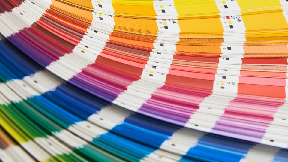
Colors carry meaning and emotion. It is important to distinguish aesthetics from function: in addition to brand colors, you also need clear colors for states such as success, warning or error. And you must not forget contrast and accessibility, because text that is hard to read hurts both the user and the brand, no matter how nice the color looks in the palette.
| Element | Without a system | With a design system |
|---|---|---|
| Buttons | Different look from page to page | One definition, applied everywhere |
| Colors | Similar but not identical shades | Precisely defined values |
| Headings | Random sizes | A clear hierarchy |
| Changes | Manual, on every page | Centralized, fast |
Branding and performance go together
A visual identity does not exist in a vacuum. If a website looks flawless but loads slowly or is hard to use on a phone, the recognition you have built loses its meaning. Good web branding always takes into account loading speed, behavior on mobile devices and clarity of navigation.
That is why a good approach connects design and development from the start. When the visual identity is built into a solid technical solution, you get a website that is beautiful, fast and reliable at the same time. If you are planning a new project, in our website development work that combination is laid down as the foundation, not added as an afterthought. You can see more about how we approach our work on our services page.
How to start and maintain consistency
You do not need a perfect brand book from day one. What matters is starting with clear basics and building the system gradually.
- Document the basics: write down your colors, fonts and logo rules in one place.
- Define components: start with the ones that repeat most often, such as buttons and cards.
- Set your tone of voice: decide how you address visitors and stick to it.
- Review regularly: as the brand grows, the system needs to be maintained, not left to go stale.
Consistency is not a limit on creativity but a framework that frees up energy for what really matters. When the basics work quietly and reliably, every new page strengthens the same impression instead of diluting it. That is how, step by step, you build recognition that lasts.